Hello, nice to meet you.
WORK
OCHA Rebrand
BWR Rebrand
Tannic Acid Blood
In the Grove Vinyl
Tableau Magazine
Bard Bakery
Dracula Redesign
Life Cycle Patterns
CASE STUDIES
BWR Rebrand
Dracula Redesign
ABOUT
Me
Resume
CONTACT
︎ ︎ ︎
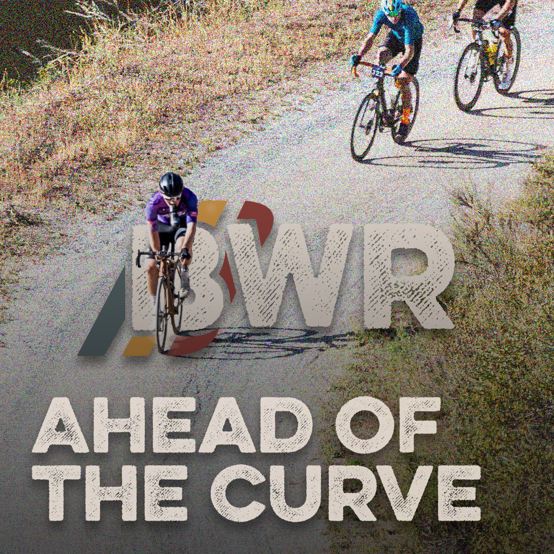
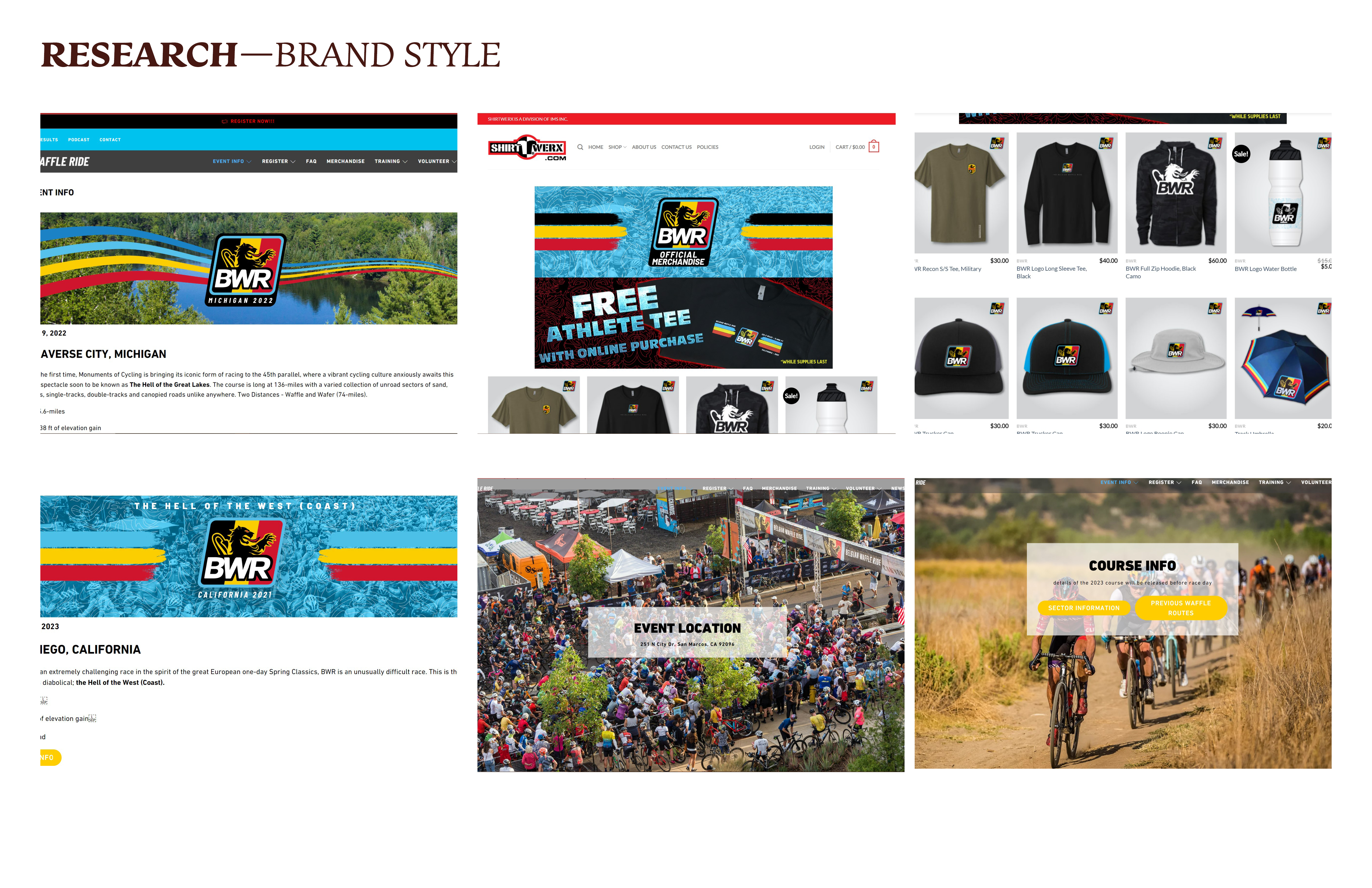
Belgian Waffle Ride Rebrand
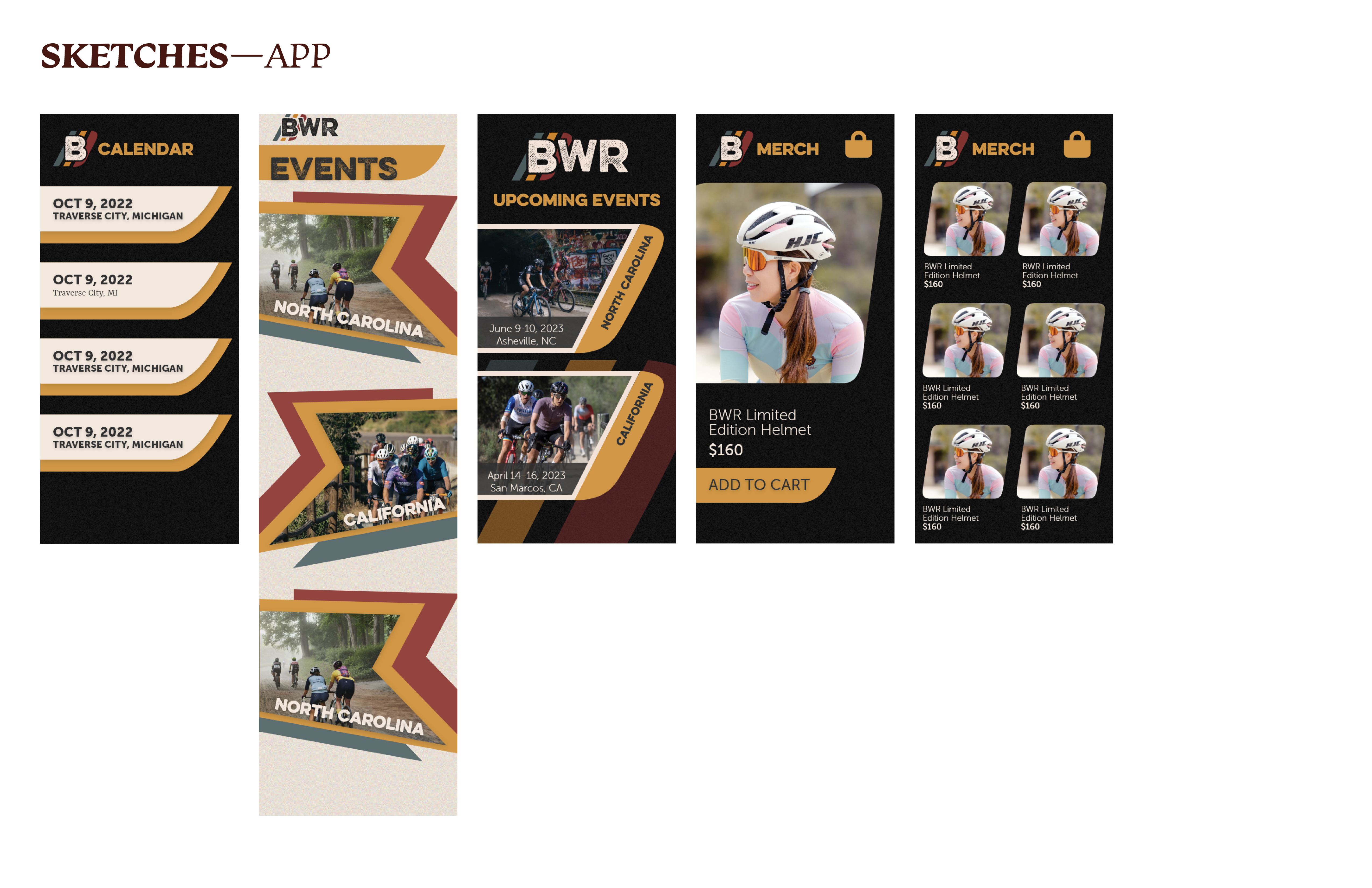
The fictional client for this project was Monuments of Cycling (MOC), which hosts its signature event, the Belgian Waffle Ride. The project was to rebrand Belgian Waffle Ride (BWR) with an updated logo, Brand I.D., and event app and update their digital advertising and marketing strategy.
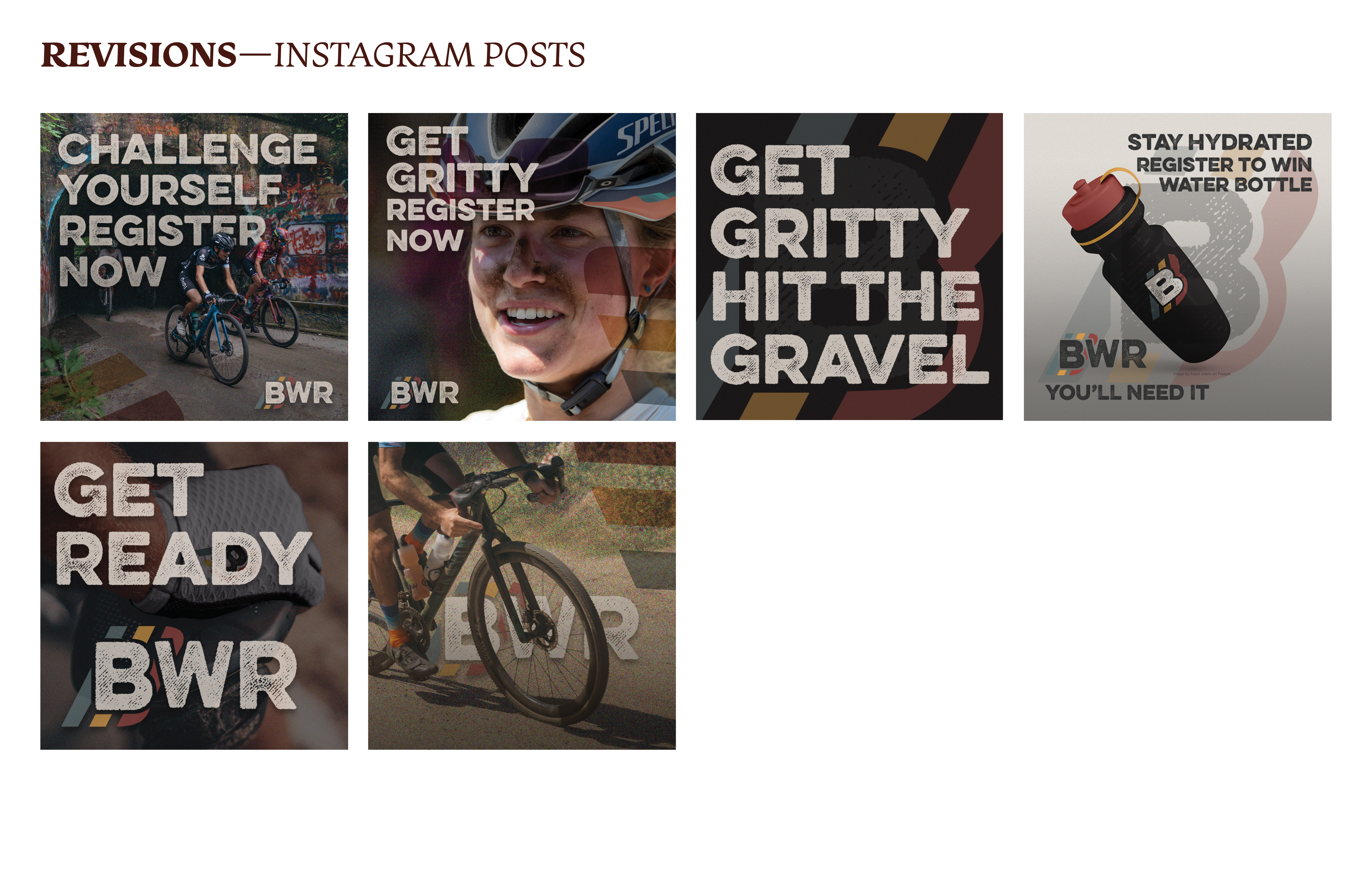
The overall concept of this rebrand for BWR is to showcase the gritty and ruggedness of gravel cycling.
The overall concept of this rebrand for BWR is to showcase the gritty and ruggedness of gravel cycling.
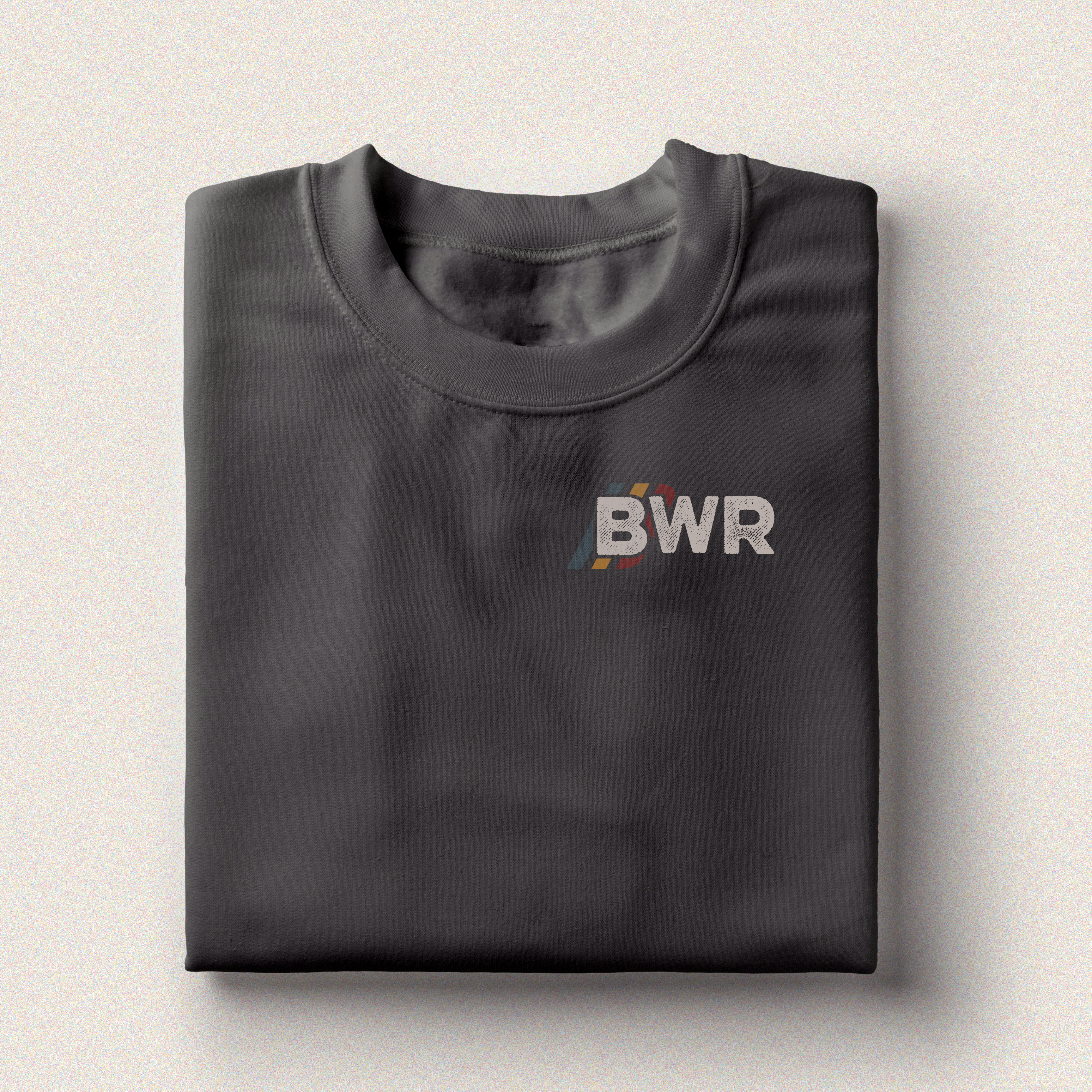
Logo Design / Branding / Digital Advertisements / App Design / Merchandise

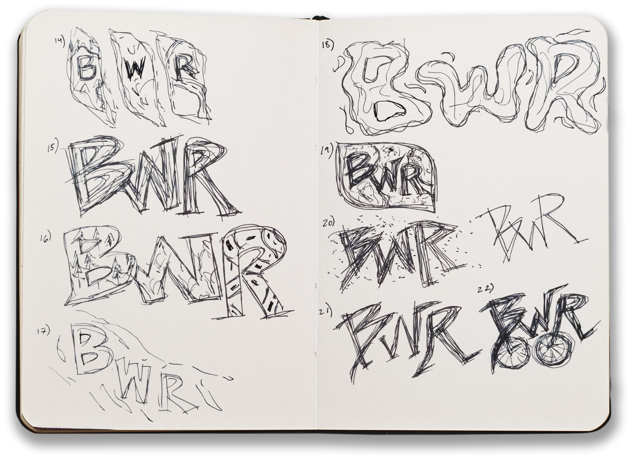
The type used for the logo “BWR” is Eveleth Slant Regular, a rough textured font that appears almost stamped on. This texture highlights the roughness and difficulty of the terrain and courses. The three stripes intersected by the “B” showcase the range of terrain: paved road, mountain, and gravel/dirt. They also reference the treads left behind the path of a bike, and the forward momentum.

 The colors chosen for these stripes are “Endurance Blue,” “Golden Waffle Yellow,” and “Racer Red,” with the type being “Road Stripe White” or “Tire Grime Black,” depending on the background color. These colors of the three stripes are found in the clothing of gravel racers. They were also chosen since they give homage to the original logo’s color scheme but are updated to match the community.


CASE STUDY
01 Mindmap

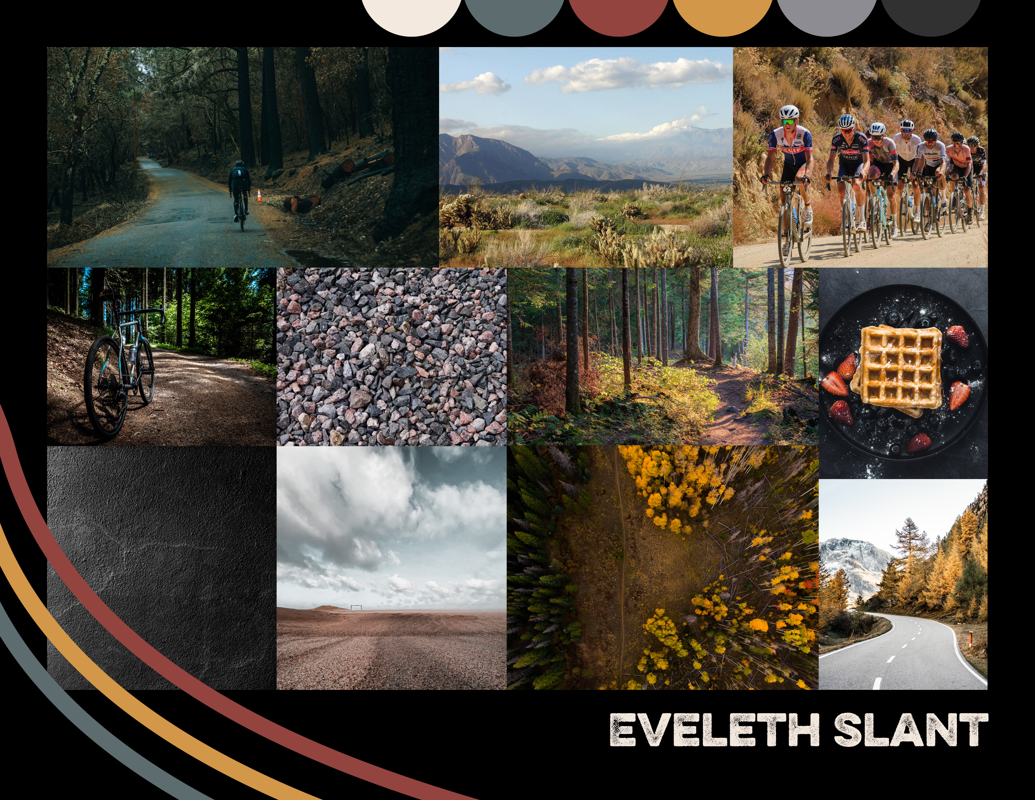
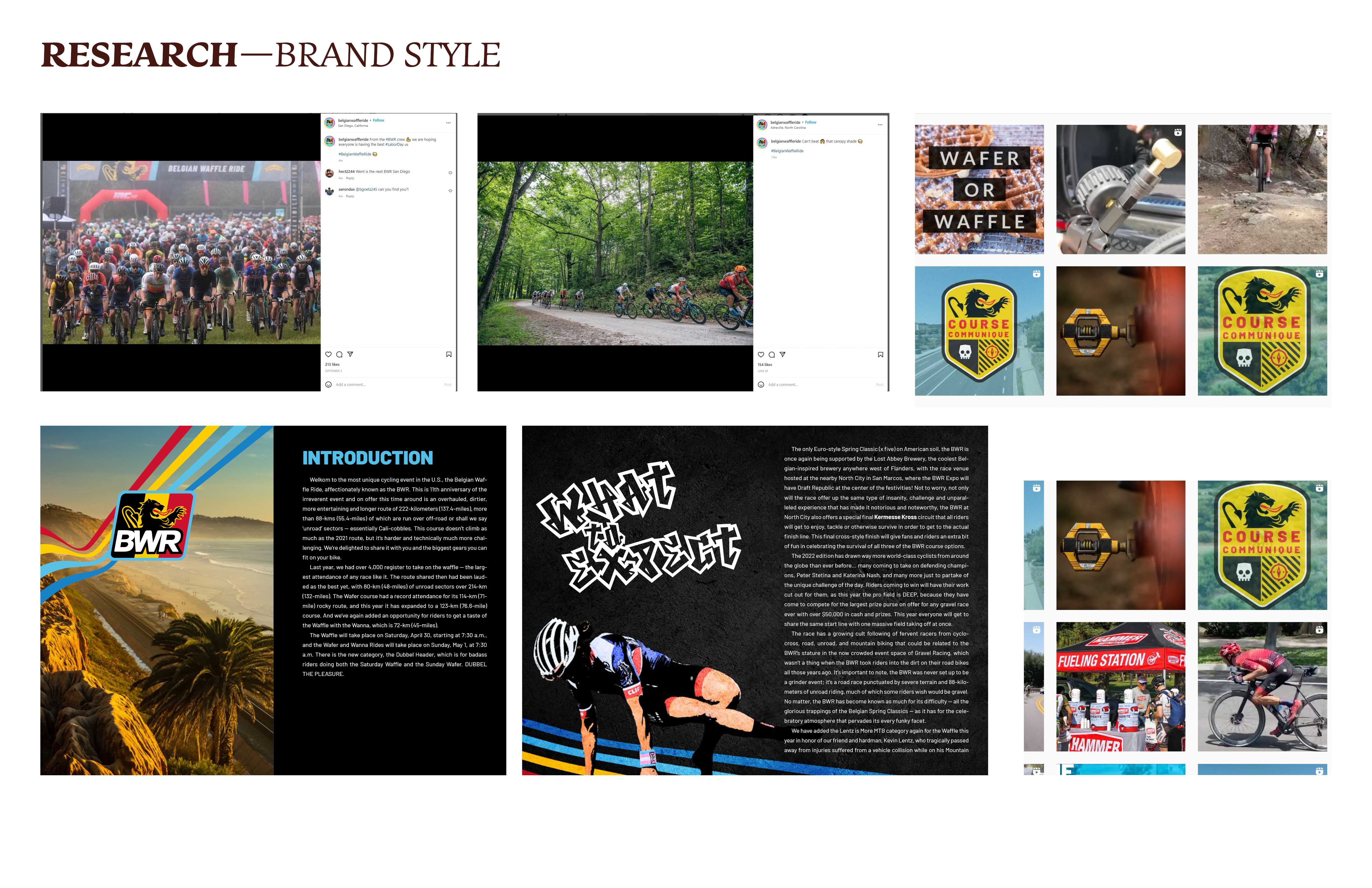
02 Mood board and Research


03 Sketches and Prototyping
Logo
Digital Comps

04 Revisions


05 Final
BrandingInstagram Posts
App Design
Merch